gothrockrulz (![[personal profile]](https://www.dreamwidth.org/img/silk/identity/user.png) gothrockrulz) wrote2011-06-24 07:52 pm
gothrockrulz) wrote2011-06-24 07:52 pm
Entry tags:
Genesis Rhapsodos Icon Tutorial #1
Program: Paint Shop Pro X2 Ultimate.
Difficulty: Intermediate?
Translatable: Unknown.
Techniques Used: Negative Space, Mask Layer, Channel Mixer, Hue/Saturation/Lightness, Luminance (Legacy).
From this:

To this:

![[livejournal.com profile]](https://www.dreamwidth.org/img/external/lj-userinfo.gif) rhoda_rants asked me how I achieved the background of this icon featuring Genesis Rhapsodos, so I thought I'd make a tutorial on it! Just be forewarned: it's very long and detailed, probably a little too overwhelming for beginners, though I've included a lot of extra explanation with beginners in mind. For those of you in a hurry, the essentials are in bold, so you can skip the rest. :)
rhoda_rants asked me how I achieved the background of this icon featuring Genesis Rhapsodos, so I thought I'd make a tutorial on it! Just be forewarned: it's very long and detailed, probably a little too overwhelming for beginners, though I've included a lot of extra explanation with beginners in mind. For those of you in a hurry, the essentials are in bold, so you can skip the rest. :)
1. First, I took my base image of Genesis (I got it from the gallery of silenttweak.net).
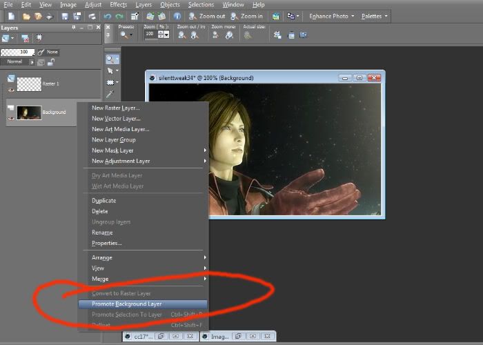
2. I made a new layer, Raster 1 (by clicking Layers>New Raster Layer). I changed the Background Layer (the pic of Genesis) by right-clicking the layer in the Layers palette and clicking Promote Background Layer. This changed the Background Layer to a Raster Layer (Raster 2), which is what I needed for the next step.

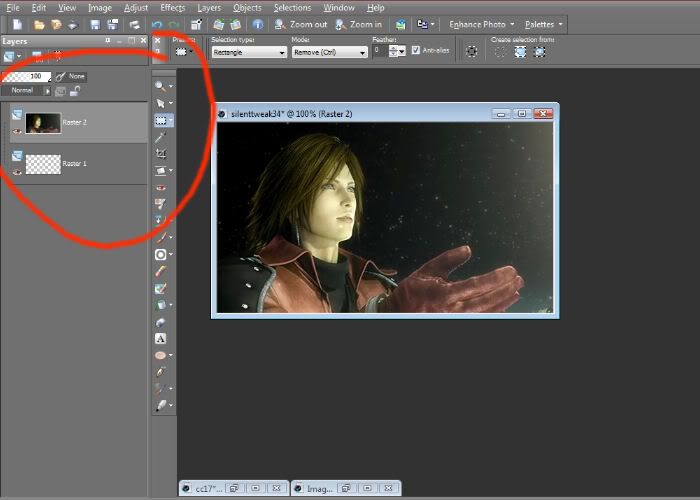
3. Then I moved the Genesis layer (Raster 2) up in the Layers palette, so now it's on top of the empty Raster 1 layer. (I always like to have an empty raster layer beneath my base, so I can fill it with whatever color I want later on.)

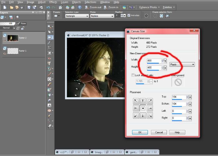
4. I wanted to resize the canvas to a perfect square, so I clicked Image>Canvas Size and set it to 480 by 480.

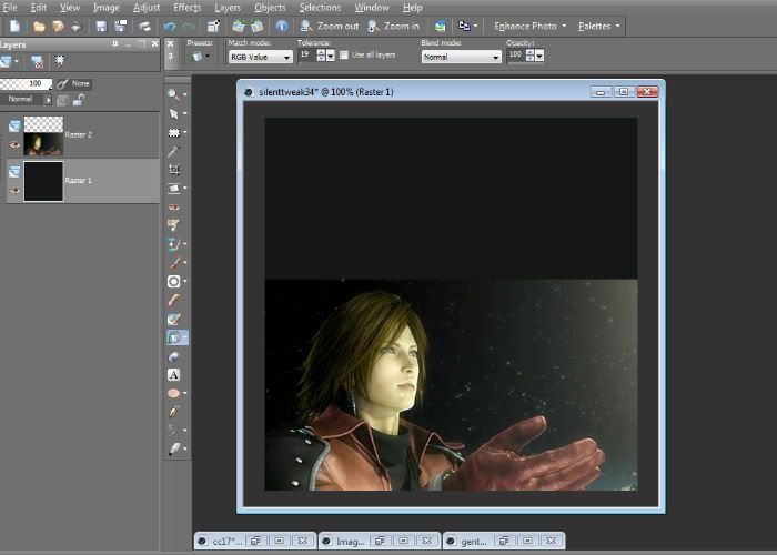
5. I moved Genesis (Raster 2) down to the bottom of the square, then filled Raster 1 with the color #171918.

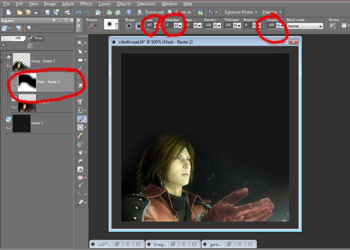
6. I created a Mask Layer (Layers>New Mask Layer>Show All). Using a regular round brush at Size 167, Hardness 0, and Opacity 100, I painted around with black until there was just a subtle blend between the Genesis Layer and the solid layer.

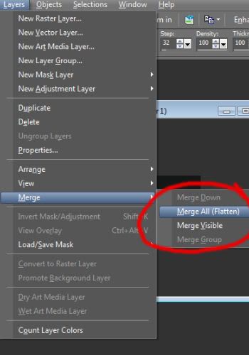
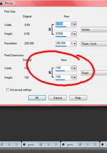
7. Now I had to flatten it (change it to just one layer) and make it icon-sized, so I clicked Layers>Merge>Merge All (Flatten) and then Image>Resize and set it to 100 by 100.


So here's the result:

8. I copied the Background Layer and set it to Screen 56. (I'm assuming even the beginners have learned their way around by now, so I'll go easier on the example pics, and just show the results for the most part.)
Result:

9. I wanted to make my icon brighter and greener, so I created a new layer, filled with #d4dcf6, and set it to Burn 8.
Then I created a Channel Mixer Layer (Layers>New Adjustment Layer>Channel Mixer) and set it to the following:
Output Channel Red: Red 96, Green 0, Blue 0
Output Channel Blue: Red, Green 100, Blue 3
Output Channel Blue: Red 0, Green 10, Blue 100.
Then I set the Channel Mixer Layer to Opacity 85.
Result:

10. I wanted a nice, ruddy purple to dominate the feel, so I created four more Raster layers. I filled the bottom of the four with #efc8f4 at Burn 18, the third with #f5dbd1 at Soft Light 40, the second with #f5dbd1 at Burn 34, and the top with #fc38f5 at Burn 7.
Result:

11. I wanted to bump up the colors, so I adapted a technique I learned a long time ago from a tutorial I can't find now. I created a new layer, filled it with #d4bef4, and set it to Luminance (Legacy) 100. (Non-PSPers may have to adapt this step for themselves, since I'm not sure if this is available with other programs.)
Result:

12. I copy merged (Edit>Copy Special>Copy Merged), so that I could make layers out of the funky-looking purplish result from the last step. I deleted the Luminance (Legacy) Layer, since I didn't need it anymore. Then I hit Ctrl+V twice, to paste two of the copy merged layers. I set the lower layer to Burn 11 and the upper layer to Hard Light 11.
Result:

13. I wanted to bring in some dark, dramatic conctrast and a little bit more color, so I hit Copy Merged again and pasted two more layers on top. I set the lower of the two to Multiply 15 and the upper to Soft Light 56. Then I created a Hue/Saturation/Lightness Layer (Layers>New Adjustment Layer>Hue/Saturation/Lightness) and set it to Hue 0, Saturation 21, Lightness 0.
Result:

14. I wanted it even darker, this time with a hint of purple and blue in the background, so I created four more raster layers. (Sorry, I just love using tons and tons of raster layers.) Working from the bottom up again, set #f1eefa to Burn 40, #cfc0f4 to Burn 18, #1879f2 to Burn 10, and #fca934 to Burn 7.
Result:

15. I wanted even more contrast and some simple light blobs on the side, so I used these three textures I made myself. (Scribbling around in an empty layer with white and then blurring it works just as well, BTW.)


I set the left layer to Screen 27, the middle to Screen 13, and the right to Screen 10.
Then I Copy Merged again, pasted this layer beneath the three screened light blob layers, and set it to Soft Light 36.
Result:

16. I grabbed four textures by one of my favorite texture creators,innocent_lexys.


I set the one on the far left to Screen 37 and used another Mask Layer to block out the sparklies obscuring Genesis' face, set the middle left to Screen 46, set the middle right to Screen 14, and set the far right to Screen 43, again using a Mask Layer to clear stuff off his face.
Result:

17. Hang in there, almost done! Still looking to make things more dark and dramatic, and still working beneath the light blob layers in the Layers Palette, I Copy Merged and pasted two more layers. I set the lower layer to Soft Light 63, and the upper layer to Multiply 95, using a Mask Layer to block out everything but Genesis' face.
Then I Copy Merged and pasted one last time, this time on top of all the other layers, including the light blob layers. I clicked Adjust>Sharpness>Sharpen, and set the layer to Normal 20. (Playing with the opacity of a sharpened layer gives you the ability to sharpen exactly as you wish, which obsessive perfectionists tend to enjoy.)
Result:
Voila! All done! (After way too many filled, copied, and masked layers to count.)
Hope this somewhat convoluted mess was helpful. At any rate, I learned something: I spend WAY too much time obsessing over my icons. LOL.
Difficulty: Intermediate?
Translatable: Unknown.
Techniques Used: Negative Space, Mask Layer, Channel Mixer, Hue/Saturation/Lightness, Luminance (Legacy).
From this:
To this:
1. First, I took my base image of Genesis (I got it from the gallery of silenttweak.net).
2. I made a new layer, Raster 1 (by clicking Layers>New Raster Layer). I changed the Background Layer (the pic of Genesis) by right-clicking the layer in the Layers palette and clicking Promote Background Layer. This changed the Background Layer to a Raster Layer (Raster 2), which is what I needed for the next step.
3. Then I moved the Genesis layer (Raster 2) up in the Layers palette, so now it's on top of the empty Raster 1 layer. (I always like to have an empty raster layer beneath my base, so I can fill it with whatever color I want later on.)
4. I wanted to resize the canvas to a perfect square, so I clicked Image>Canvas Size and set it to 480 by 480.
5. I moved Genesis (Raster 2) down to the bottom of the square, then filled Raster 1 with the color #171918.
6. I created a Mask Layer (Layers>New Mask Layer>Show All). Using a regular round brush at Size 167, Hardness 0, and Opacity 100, I painted around with black until there was just a subtle blend between the Genesis Layer and the solid layer.
7. Now I had to flatten it (change it to just one layer) and make it icon-sized, so I clicked Layers>Merge>Merge All (Flatten) and then Image>Resize and set it to 100 by 100.
So here's the result:
8. I copied the Background Layer and set it to Screen 56. (I'm assuming even the beginners have learned their way around by now, so I'll go easier on the example pics, and just show the results for the most part.)
Result:
9. I wanted to make my icon brighter and greener, so I created a new layer, filled with #d4dcf6, and set it to Burn 8.
Then I created a Channel Mixer Layer (Layers>New Adjustment Layer>Channel Mixer) and set it to the following:
Output Channel Red: Red 96, Green 0, Blue 0
Output Channel Blue: Red, Green 100, Blue 3
Output Channel Blue: Red 0, Green 10, Blue 100.
Then I set the Channel Mixer Layer to Opacity 85.
Result:
10. I wanted a nice, ruddy purple to dominate the feel, so I created four more Raster layers. I filled the bottom of the four with #efc8f4 at Burn 18, the third with #f5dbd1 at Soft Light 40, the second with #f5dbd1 at Burn 34, and the top with #fc38f5 at Burn 7.
Result:
11. I wanted to bump up the colors, so I adapted a technique I learned a long time ago from a tutorial I can't find now. I created a new layer, filled it with #d4bef4, and set it to Luminance (Legacy) 100. (Non-PSPers may have to adapt this step for themselves, since I'm not sure if this is available with other programs.)
Result:
12. I copy merged (Edit>Copy Special>Copy Merged), so that I could make layers out of the funky-looking purplish result from the last step. I deleted the Luminance (Legacy) Layer, since I didn't need it anymore. Then I hit Ctrl+V twice, to paste two of the copy merged layers. I set the lower layer to Burn 11 and the upper layer to Hard Light 11.
Result:
13. I wanted to bring in some dark, dramatic conctrast and a little bit more color, so I hit Copy Merged again and pasted two more layers on top. I set the lower of the two to Multiply 15 and the upper to Soft Light 56. Then I created a Hue/Saturation/Lightness Layer (Layers>New Adjustment Layer>Hue/Saturation/Lightness) and set it to Hue 0, Saturation 21, Lightness 0.
Result:
14. I wanted it even darker, this time with a hint of purple and blue in the background, so I created four more raster layers. (Sorry, I just love using tons and tons of raster layers.) Working from the bottom up again, set #f1eefa to Burn 40, #cfc0f4 to Burn 18, #1879f2 to Burn 10, and #fca934 to Burn 7.
Result:
15. I wanted even more contrast and some simple light blobs on the side, so I used these three textures I made myself. (Scribbling around in an empty layer with white and then blurring it works just as well, BTW.)
I set the left layer to Screen 27, the middle to Screen 13, and the right to Screen 10.
Then I Copy Merged again, pasted this layer beneath the three screened light blob layers, and set it to Soft Light 36.
Result:
16. I grabbed four textures by one of my favorite texture creators,
I set the one on the far left to Screen 37 and used another Mask Layer to block out the sparklies obscuring Genesis' face, set the middle left to Screen 46, set the middle right to Screen 14, and set the far right to Screen 43, again using a Mask Layer to clear stuff off his face.
Result:
17. Hang in there, almost done! Still looking to make things more dark and dramatic, and still working beneath the light blob layers in the Layers Palette, I Copy Merged and pasted two more layers. I set the lower layer to Soft Light 63, and the upper layer to Multiply 95, using a Mask Layer to block out everything but Genesis' face.
Then I Copy Merged and pasted one last time, this time on top of all the other layers, including the light blob layers. I clicked Adjust>Sharpness>Sharpen, and set the layer to Normal 20. (Playing with the opacity of a sharpened layer gives you the ability to sharpen exactly as you wish, which obsessive perfectionists tend to enjoy.)
Result:
Voila! All done! (After way too many filled, copied, and masked layers to count.)
Hope this somewhat convoluted mess was helpful. At any rate, I learned something: I spend WAY too much time obsessing over my icons. LOL.
no subject
no subject
no subject
Yes, Final Fantasy forever! (Genesis is the one I have to thank for introducing me to Gackt, after all.) :D
no subject
no subject
What program do you use for graphix? I use GIMP, but I think I could create a similar effect with those textures.
no subject